

Designing Responsive Email Templates: Best Practices & Free Tools
- Dr. Anubhav Gupta

- Oct 6, 2025
- 4 min read
Create email templates that look flawless on any device—without breaking the bank.
Responsive design ensures your subscribers have a seamless experience whether they read your emails on desktop, tablet, or mobile. By combining layout best practices, lightweight coding techniques, and free design platforms, you can build adaptable templates that drive engagement and conversions.
1. Why Responsive Email Matters for Action‑Centric Campaigns
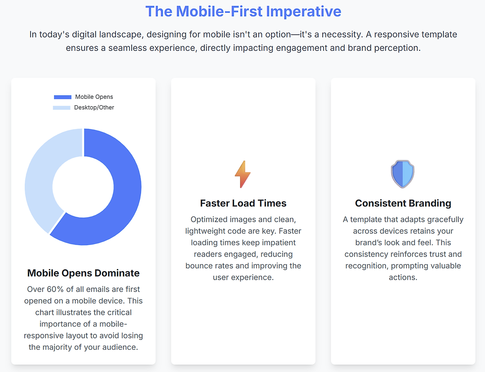
Mobile opens dominate: Over 60 % of email is read on smartphones—if your layout breaks, you lose clicks.
Faster load times: Optimized images and clean HTML/CSS reduce load time, keeping impatient readers engaged.
Consistent branding: A template that adapts retains your brand’s look and feel, reinforcing trust and prompting actions like “Shop Now” or “Register Today.”
2. Five Core Best Practices | Responsive EMail
Fluid Grid Layouts
Use percentage‑based widths (e.g., width: 100%; max-width: 600px;) so columns stack or resize gracefully.
Mobile‑First Media Queries
Start styling for small screens, then override for larger devices with @media only screen and (min-width: 600px) { … }.
Inline CSS & Table Structure
Leverage nested tables for reliability across email clients and apply styles inline to ensure consistency.
Scalable Images & Web‑Safe Fonts
Define images with max-width: 100%; height: auto; and choose fonts like Arial, Verdana, or system stacks for broad compatibility.
Accessible & Touch‑Friendly Elements
Design buttons with at least 44×44 px tap areas, use semantic alt text for images, and maintain high color contrast for readability.
3. Step‑by‑Step: Building Your First Responsive Template
Sketch Your Layout
Draft wireframes for header, body, and footer sections—consider single‑column vs. two‑column flows.
Set Up a Base HTML File
Include a <meta name="viewport" content="width=device-width, initial-scale=1.0"> tag for scaling.
Create a Fluid Container
html
CopyEdit
<table width="100%" cellpadding="0" cellspacing="0">
<tr>
<td align="center">
<table width="600" cellpadding="0" cellspacing="0">
<!-- Your content here -->
</table>
</td>
</tr>
</table>
Add Media Queries
css
CopyEdit
@media only screen and (max-width: 480px) {
.two-column { display: block !important; width: 100% !important; }
.button { width: 100% !important; }
}
Test Across Devices & Clients
Use free tools like Litmus PutsMail or Email on Acid’s trial to catch client‑specific quirks.

4. Free Tools & Frameworks
Category | Tool/Framework | Key Features |
Template Builders | Drag‑and‑drop editor, HTML export | |
Code Frameworks | MJML | Simplified markup that compiles to responsive HTML |
Testing & Previews | PutsMail (by Litmus) | Send to real inbox, check rendering |
Image Optimization | TinyPNG | Compress PNG/JPEG with minimal quality loss |
Icon Libraries | Font Awesome | Scalable vectors—no extra HTTP requests |

5. Leveraging NLP for Dynamic Content Blocks
Automate personalization within your templates by integrating simple NLP techniques:
Keyword Extraction: Scan user‑generated content (e.g., survey responses) to auto‑insert relevant product images or headlines.
Sentiment‑Based Color Themes: Analyze sentiment in feedback to adjust banner text or button copy—warm “Thank You” tones for positive feedback, more neutral CTAs for suggestions.
AI‑Generated Preheaders: Use transformer models (like DistilBERT) fine‑tuned on past campaigns to craft preheaders that complement your subject lines and boost open rates.
6. SEO & AEO Optimization for Template Tutorials
Targeted Keywords: Incorporate “responsive email templates,” “email design best practices,” and “free email design tools” naturally in headings and body text.
Snippet‑Friendly Lists: Numbered steps and bullet lists help voice assistants pull concise answers (e.g., “What are the top 5 email design best practices?”).
Structured Data: Include a “HowTo” schema for tutorial sections to appear in rich results.
Mobile‑Optimized Formatting: Short paragraphs, clear H2/H3 labels, and ample whitespace ensure readability across devices—essential for voice search.

7. Common Pitfalls & How to Avoid Them
Relying on Background Images: Many clients don’t support them—use inline images with alt text instead.
Overcomplicating Layouts: Limit to one or two columns; complex grids often break on small screens.
Neglecting Preheader Text: A well‑crafted preheader (50–90 characters) boosts open rates—don’t forget to include it inline at the top of your HTML.
By following these best practices and leveraging free tools, you’ll build responsive email templates that look great on any device—and drive the clicks, opens, and conversions your campaigns need.
Frequently Asked Questions
What is responsive email design and why is it important?
Responsive email design uses flexible layouts, fluid images, and media queries to ensure your emails adapt seamlessly to any screen size. It’s crucial because over 60 % of emails are opened on mobile devices—without responsiveness, your content may break, reducing engagement and conversions.
How do fluid grid layouts work in email templates?
Fluid grids use percentage‑based widths (e.g., width: 100%; max-width: 600px;) so that columns resize or stack based on the screen. This ensures your multi‑column designs collapse neatly on smaller devices without awkward gaps or horizontal scrolling.
What role do media queries play in making emails responsive?
Media queries let you apply CSS rules conditionally based on screen size. By targeting breakpoints (e.g., @media only screen and (max-width: 480px)), you can adjust font sizes, stack columns, and resize buttons to optimize readability and tap targets on mobile devices.
Which free tools are best for building and testing responsive templates?
Stripo.email for drag‑and‑drop design and HTML export
MJML for simplified markup that compiles to responsive HTML
PutsMail (Litmus) for real‑inbox rendering previews
TinyPNG for compressing images without quality loss
How can I ensure images and fonts remain scalable across devices?
Define images with max-width: 100%; height: auto; so they resize fluidly. Stick to web‑safe fonts (Arial, Verdana, system stacks) or include font‑fallbacks. This combination maintains consistency and prevents broken layouts when custom fonts aren’t supported.
What are common pitfalls in responsive email design and how do I avoid them?
Background images often fail in some clients—use inline images with descriptive alt text.
Overly complex grids can break on small screens—limit templates to one or two columns.
Missing preheaders reduce open rates—always include a clear preheader (50–90 characters) at the top of your HTML.


Comments